Bumble
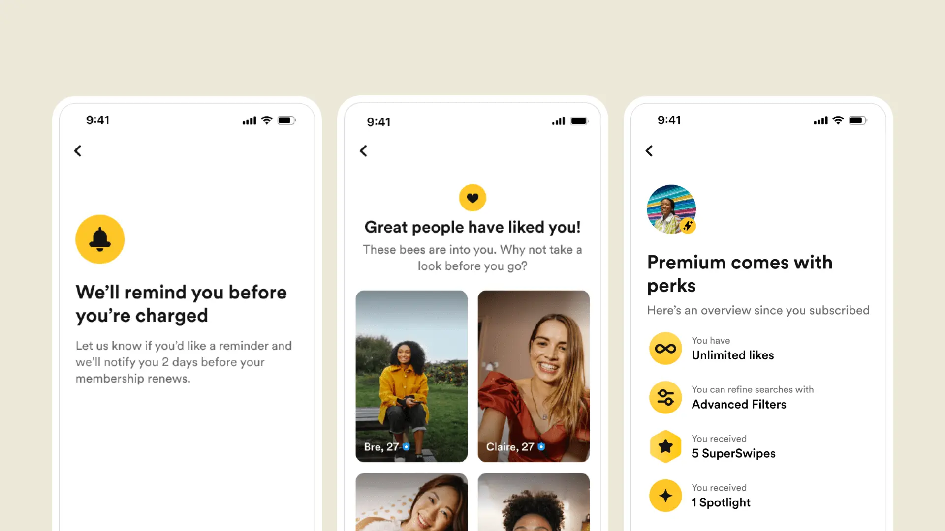
Designing for retention (without making it feel like a trap)

The setup
Retention is one of those problems that gets more interesting the deeper you go.
At Bumble, we started noticing a pattern: users would subscribe, cancel quickly, and then… stick around. They weren’t done with the product. But something about the subscription experience just wasn’t clicking.
We realized we needed to stop thinking in terms of churn and start thinking in terms of behavior.
What actually causes someone to leave? What makes them stay? And how can we design around that without relying on friction?
What we learned
We dug into everything—exit surveys, cancellation flows, interviews, behavior data—and surfaced a few recurring truths:
People cancel for reasons that have nothing to do with product performance
Some cancel because they’ve found love (which is technically a win)
Others just don’t want to forget to cancel auto-renew
And some never found enough value in the first place
We grouped these into clear behavioral segments—first-time users, early cancelers, power switchers, success stories—and started building around those, not just the business goals.
What we did
We shifted away from blanket retention tactics and instead crafted tailored journeys based on how people actually behave.
That meant:
Designing cancellation flows that were frictionless and compliant
Showing contextual messaging that acknowledged why someone was leaving (not just that they were)
Celebrating success when someone found love instead of trying to win them back
Giving flexibility where users needed it most, and space where it mattered
We even redesigned flows that made it easier to unsubscribe—because we believe trust is a retention strategy.
Technologies & Tools
Want to discuss this project?
I'd be happy to share more details about my approach, challenges faced, and results achieved.